Introduced in 0.2. Layouts allow you to adjust the layout of the forms in StreamControl as well as add and remove any additional fields you may need in your overlays.
Layout Item
layout
This is essentially the container for all other items in your layout. Here you can set the size of the form, as well as whether or not your layout is tabbed.
Attributes
width (required): Width of your layout.
height (required): Height of your layout.
tabbed: Set to 1 if you want a tabbed layout. Follows the same rules as a tabSet.
Example:
<layout width="400" height="140" tabbed="1"></layout>
Label Item
label
Allows you to put text on your layout.
Attributes
width (required): Width of your item.
height (required): Height of your item.
x (required): x position.
y (required): y position.
Example:
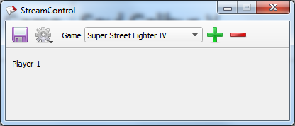
<label x="10" y="14" width="46" height="13">Player 1</label>
LineEdit Item
lineEdit
Puts a text field on your layout.
Attributes
id (required): This is the field that you will see in your streamcontrol.xml file as well as how you will address the field from the swap and reset buttons.
width (required): Width of your item.
height (required): Height of your item.
x (required): x position.
y (required): y position.
dataSet: The csv file (relative to the layout file) to read and write from. Will enable autocompletion.
dataField (default: 1): Which field in the CSV file to draw it’s data from.
master: Will update when the given lineEdit ID is updated with an autocompleted value.
Can have placeholder text for when textbox is empty. For lineEdits that are masters, clicking the small cross will delete the entry currently in the field from the CSV.
Example:
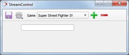
<lineEdit id="pName1" x="60" y="10" width="171" height="20" />
SpinBox Item
spinBox
Puts a Spin Box on your layout.
Attributes
id (required): This is the field that you will see in your streamcontrol.xml file as well as how you will address the field from the swap and reset buttons.
width (required): Width of your item.
height (required): Height of your item.
x (required): x position.
y (required): y position.
maximum : How high your spinbox goes. Default is 99.
Example:
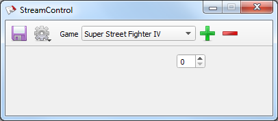
<spinBox id="pScore1" x="250" y="10" width="42" height="22" maximum="999" />
checkBox Item
checkBox
Puts a Check Box on your layout. Outputs either 1 or 0;
Attributes
id (required): This is the field that you will see in your streamcontrol.xml file as well as how you will address the field from the swap and reset buttons.
width (required): Width of your item.
height (required): Height of your item.
x (required): x position.
y (required): y position.
Example:
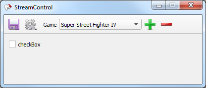
<checkBox x="10" y="10" width="80" height="20" id="checkBox">checkBox</checkBox>
RadioGroup Item
radioGroup
Allows you to put a radioGroup on your layout.
Attributes
id(required): Give your radioGroup a unique id.
Elements
radioButton
radioButton
The radio buttons inside a radio group.
Attributes
value(required): The value to return to the radio group when selected.
width (required): Width of your item.
height (required): Height of your item.
x (required): x position.
y (required): y position.
Example:
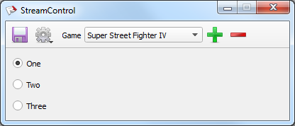
<radioGroup id="radioValue">
<radioButton x="10" y="10" width="80" height="20" value="0">One</radioButton>
<radioButton x="10" y="40" width="80" height="20" value="1">Two</radioButton>
<radioButton x="10" y="70" width="80" height="20" value="2">Three</radioButton>
</radioGroup>
Button Item
button
Puts a button on your layout. Right now can be one of two types “Reset” or “Swap”
Attributes
id (required): Give your button a unique id.
width (required): Width of your item.
height (required): Height of your item.
x (required): x position.
y (required): y position.
type (required): Either “reset” or “swap“.
Reset Button
reset (required): Comma delimited list of the field ids you want to reset. Will clear a lineEdit and set a spinBox to 0.
Swap Button
swapSet1 & swapSet2 (required): Comma delimited lists of the field ids you want to swap. Order is important as it uses the order to figure out which fields swap with which.
Example:
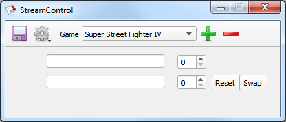
<lineEdit id="pName1" x="60" y="10" width="171" height="20" />
<lineEdit id="pName2" x="60" y="40" width="171" height="20" />
<spinBox id="pScore1" x="250" y="10" width="42" height="22" maximum="999" />
<spinBox id="pScore2" x="250" y="40" width="42" height="22" maximum="999" />
<button type="reset" x="300" y="40" width="41" height="23" tooltip="Reset the Scores" id="reset" reset="pScore1,pScore2">Reset</button>
<button type="swap" x="340" y="40" width="41" height="23" tooltip="Swap the Scores" id="swap1" swapSet1="pName1,pScore1" swapSet2="pName2,pScore2">Swap</button>
TabSet Item
tabSet
Allows you to put a tab set on your layout.
Attributes
width (required): Width of your tab set.
height (required): Height of your tab set.
x (required): x position.
y (required): y position.
Elements
Tab
tab
A tab group containing the items in question.
Attributes
name (required): The name of your tab group.
scrollable: Set to “1” if you want the tab to be scrollable. Will auto fit to content.
Example:
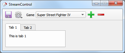
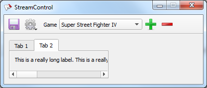
<tabSet x="10" y="10" width="200" height="80">
 <tab name="Tab 1">
  <label x="10" y="10" width="200" height="13">This is tab 1</label>
 </tab>
 <tab name="Tab 2" scrollable="1">
  <label x="10" y="10" width="800" height="13">This is a really long label. This is a really long label. This is a really long label.</label>
 </tab>
</tabSet>
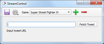
Tweet Item
tweet
Put a tweet widget on your layout. Click fetch tweet once to retrieve Auth Token, then click again to retrieve tweet. When text says “Ok” you can click save.
Attributes
id (required): Give your tweet widget a unique id.
width (required): Width of your item.
height (required): Height of your item.
x (required): x position.
y (required): y position.
picPath (default: “twitter”): Path relative to where streamcontrol.xml is written.
Example:
<tweet id="twitter" x="10" y="10" width="380" height="60" picPath="twitter" />
ComboBox Item (0.4 and above)
comboBox
Adds a dropdown menu to your layout.
Attributes
id (required): Give your tweet widget a unique id.
width (required): Width of your item.
height (required): Height of your item.
x (required): x position.
y (required): y position.
editable: Setting it to “1” allows you to enter custom text into the combo box as a value.
Elements
Combobox Items
comboItem
An item to be selected in the combobox.
Attributes
value: A custom value to output if different from the text in the element.
selected: Set to “1” if you want to be selected by default.
Example:
<comboBox id="combo" width="150" height="20" x="50" y="130" editable="1" >
  <comboItem selected="true" value="Test1">This is a test</comboItem>
  <comboItem>Test2</comboItem>
  <comboItem>Test3</comboItem>
</comboBox>

